‘Starving‘ is the 2021 final degree project for Animation students. The goal of this group project is for each student to leave school to successfully enter the professional world. During it, the students reproduce the organization and workflow of a real Animation studio. They distribute roles, work as a team, put themselves to the test, correct errors, improve skills and finish polishing themselves as animators. To find out the details of the work done in the Concept Art area of the short film ‘Starving’, we have spoken with the student Catarina Ferreira.
What story does ‘Starving’ tell and where did the idea come from?
It is the story of Álex, a graphic illustrator who works in a design office in the 2000s. Her colleagues consider her the company’s weirdo. When the lunch break arrives, Álex is very hungry and realizes that she will go without food for two reasons. First, her classmates are running out of vending machine stock. The second, has a lot of workload. The need to eat food plays with his mind and he begins to transform his companions into food.
What animation style do you propose in the short film and how did you arrive at it?
It’s a very cartoon style based on our tastes and 2D Animation references like ‘The Amazing World of Gumball‘ or ‘Steven Universe’. My partner Karma Juliana too It has guided us a lot because it has a very graphic style, like the one we wanted for the short.
The color palette of the short is strident and risky. How did you get to it?
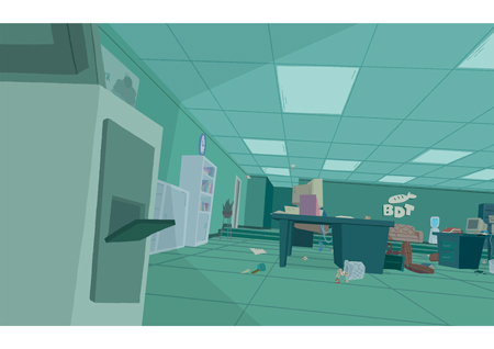
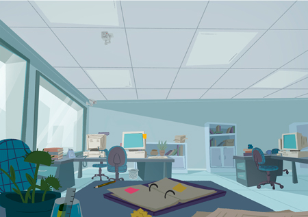
We wanted the colorscript of the short to highlight the two worlds that interact in the short: reality and Alex’s mind. On the one hand, the office is a monotone space, with highly desaturated colors. For the backgrounds of the short we decided to add color on the walls -turquoise blue with a soft tone- and on the desk elements -more saturated props-.
On the other hand, Alex’s psychedelic world is very graphic and color saturated. The protagonist had to draw a little more attention compared to the rest of the characters. Therefore, her hair is more saturated and pinkish, in contrast to the more gray and blue backgrounds.

In ‘Starving’ we find 83 different backgrounds. How did you create them and what would you highlight?
For the working time we had, we created quite a few funds. To speed up and facilitate the work we use a 3D base of the office. From this, we adapt each background to the needs of the story in terms of perspectives and points of view. Also, in each background we were very careful to keep the same props on each desk: chair, trash, camera, etc.
How did you translate the personality of the characters into their design?
My partner Karma Juliana did a fantastic job on the Character Design of all the characters. For Álex, she designed a long-legged and less human character, compared to the rest of the characters. For the office workers, she devised more stereotyped figures, aligned with the food they transform into.
If you had to highlight a scene or shot that you liked working on, what would it be and why?
I really like the shot of the Boss walking in front of Álex’s desk. It was one of the first shots finished and we worked together Juan José Becerra -character animator- and me – background-. Unlike what happens in a real production, in this case my background was adapted to an animation created by Juanjo. It was very interesting to work together on the process to simplify the work for the two departments. Also, I love the background itself because it guides the viewer’s eye to what is most important in the scene. And the shadows flow nicely with the animation and composition of the image.
To finish, how would you rate the short film experience?
I really liked working as a team with my course. Not only are we a phenomenal artist course, but it’s also great to be able to work with friends. We liked the result a lot. Taking into account the working time, organization issues and the fact that we are all students, I think we have made a pretty cool short.

