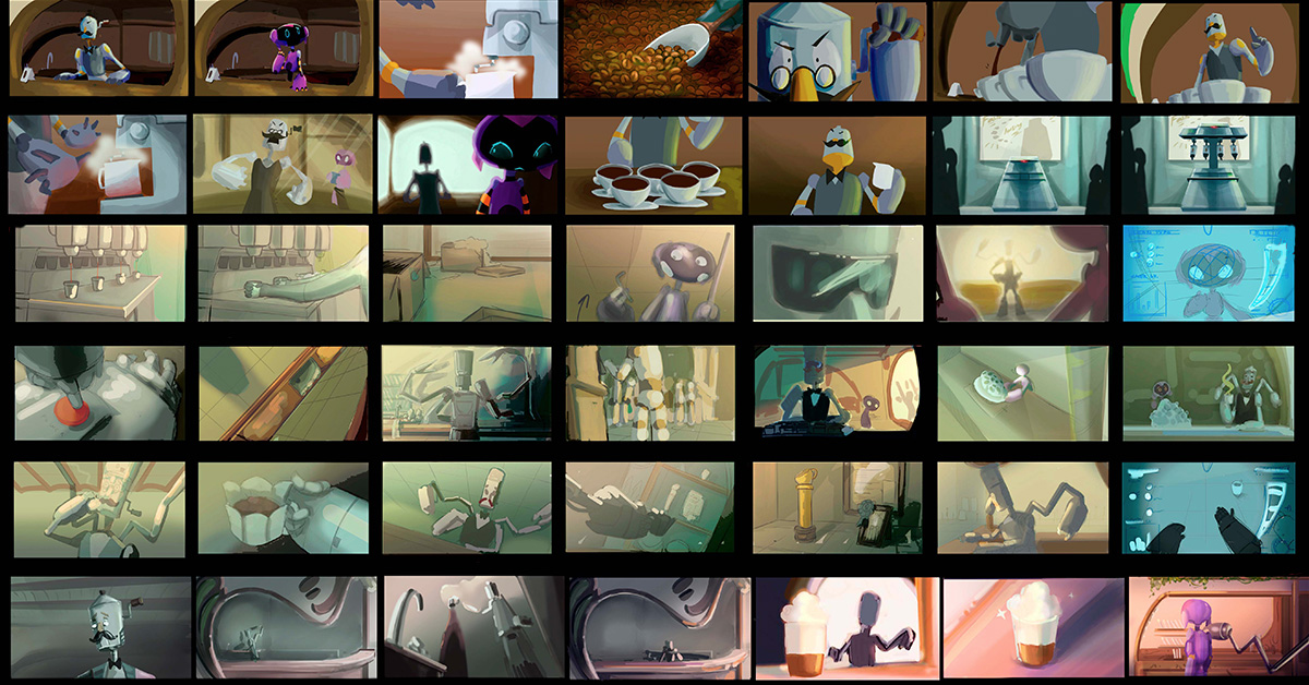
‘Mocca’ is a 3D Animation short film of modernist inspiration whose backgrounds are made up of two different spaces. On the one hand, the cafeteria run by the protagonist of the short film, Mocca. And, on the other hand, the shopping centre in which it is located. In the creation of the design of each space, the students of the Art specialisation wanted to transmit the singularity of each environment to the spectator. We talked to Alvaro Pozo and Ivan Rodríguez, students of the Art specialisation, about the work developed in this area.
What is the colour palette of ‘Mocca’ like?
Ivan: ‘Mocca’ is a realistic short film, so the colorscript had to be based on that. Then we tried to give more personality to certain moments of the story. And we have achieved this by saturating the colour a bit or creating a more charged atmosphere.
Alvaro: We wanted to create a warm colour palette, with cooler colour changes in certain scenes, such as the villain and Mocca’s change of attitude.
What inspired you to create the Mocca cafeteria?
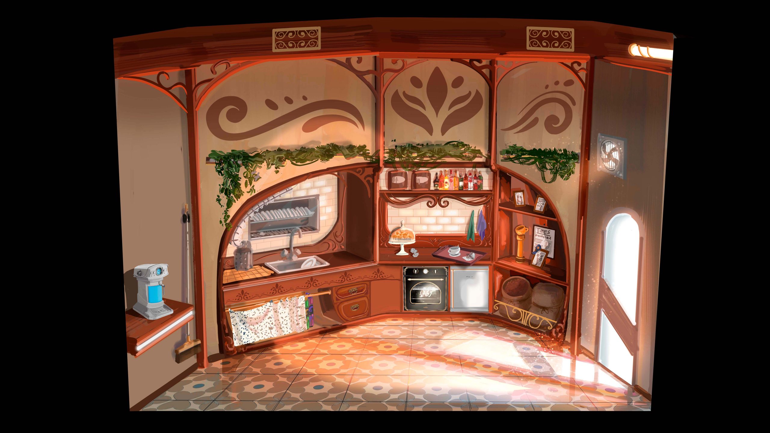
Alvaro: The basis of the cafeteria is the Modernist style. In its design we wanted to draw an old and traditional establishment.
Ivan: The cafeteria run by Mocca is in the Art Nouveau style. From the Art Department we considered that, in contrast to the shopping centre in which it is located, it gave more naturalness to Mocca’s character.
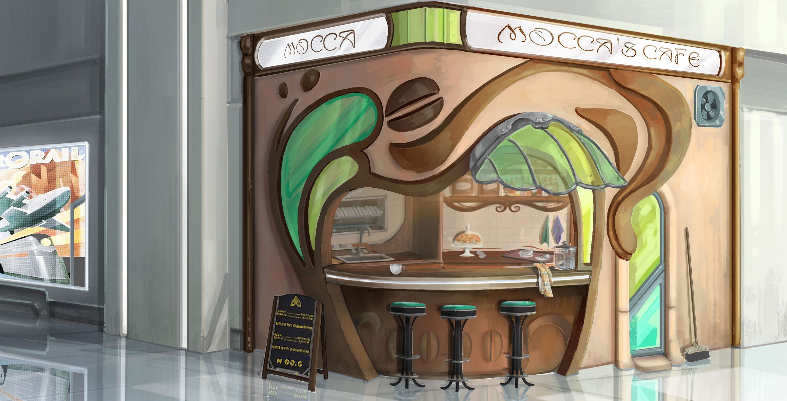
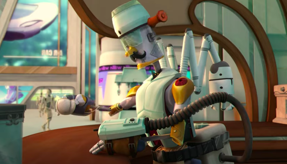
And what is the shopping centre in which it is located like?
Alvaro: In the design of the shopping centre we were looking for a futuristic style, much more straight and cold, contrasting with the cafeteria. The difference in style and colour between the main establishment, which is old, and the surrounding area, which is much more technologically advanced, was important.
Ivan: Its design is inspired by Art Deco. It is a very geometric and cold style, which fitted with the mood we wanted to capture. It also contrasted with the café and helped the narrative of the character as the shopping centre looks newer than the café.
If you had to highlight one keyframe that you enjoyed working on, what would it be?
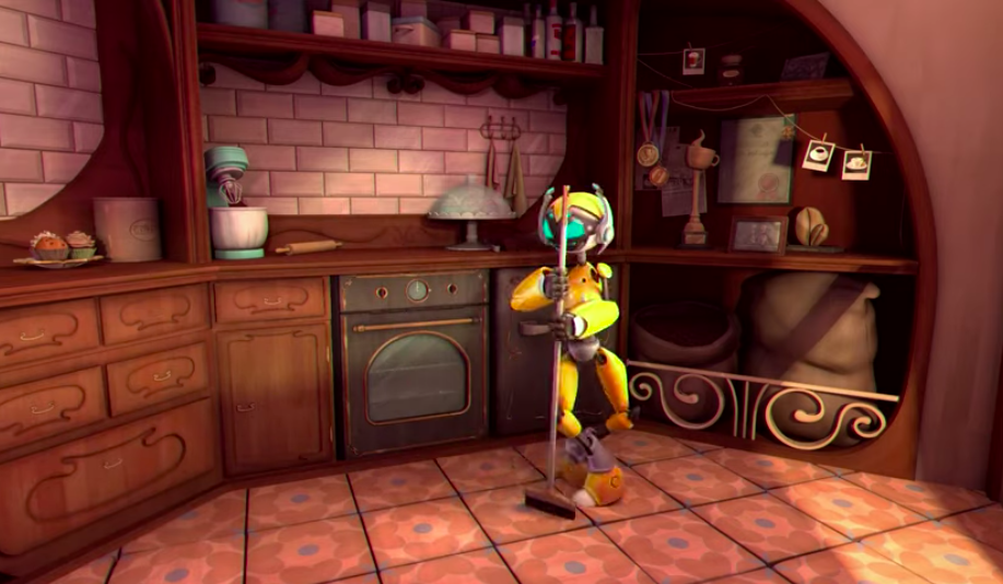
Ivan: I especially like the rendering of the interior of the cafeteria. This was the first one in which we could see a final design of the establishment in colour and with the lighting. It was also the one I used to test the lighting for the short film.
Alvaro: I liked to work on the lighting aspect of the project. For this reason, I preferred to focus on the colourscript.